ST 558 Project 3
Eric Warren & Chandler Ellsworth
2023-11-11
Introduction
The objective of this program is to create predictive models and
automate R markdown reports utilizing the
Diabetes Health Indicators Dataset.
Specifically, we’ll be using the
diabetes_binary_health_indicators_BRFSS2015.csv data. This is a data
set of survey responses to the CDC’s 2015
Behavioral Risk Factor Surveillance System (BRFSS). The BRFSS is a
“health-related telephone survey that is collected annually by the CDC.
Each year, the survey collects responses from over 400,000 Americans on
health-related risk behaviors, chronic health conditions, and the use of
preventative services.”
The data set has 21 feature variables and one response,
Diabetes_binary, that has 2 classes. 0 indicates no diabetes, while a
1 indicates pre-diabetes or having diabetes. While there are numerous
features, some of the most important that we utilized in our analysis
were:
HighBP: HighBP corresponds to High Blood Pressure and takes on 0 if no high blood pressure and 1 if high blood pressureHighChol: HighChol corresponds to High Cholesterol and takes on 0 if no high blood cholesterol and 1 if high cholesterolCholCheck: CholCheck corresponds to Cholesterol Check and takes on 0 if no cholesterol check and 1 if cholesterol checkBMI: BMI corresponds to Body Mass Index and takes on numeric integersPhysActivity: PhysActivity corresponds to physical activity in the past 30 days - not including job. It takes on 0 if no and 1 if yesHvyAlcoholConsump: HvyAlcoholConsump corresponds to heavy drinkers (adult men having more than 14 drinks per week and adult women having more than 7 drinks per week). The values are 0 if no, 1 if yesGenHlth: GenHlth is on a scale of 1 to 5 and asks, would you say that in general your health is: 1 = excellent, 2 = very good, 3 = good, 4 = fair, and 5 = poorMentHlth: MentHlth asks to think about your mental health, which includes stress, depression, and problems with emotions, for how many days during the past 30 days was your mental health no good? This is on a scale of 1-30 daysPhysHlth: PhysHlth asks to think about your physical health, which includes physical illness and injury, for how many days during the past 30 days was your physical health no good? This is on a scale of 1-30 daysSex: Sex corresponds to o for females and 1 for malesAge: Age is a 13 level age category with corresponding age intervals taking on a value between 1 and 13
Utilizing these features and response, we will first do basic
exploratory data analysis (EDA) to produce meaningful summary statistics
and plots about the our data, especially as it relates to our response.
The summary statistics will comprise means, group standard deviations,
and contingency tables. Since the Education level will change for each
report and corresponding data, a discussion of what to look for in the
summary statistics and plots will be provided as opposed to direct
trends.
After analyzing the data through our EDA, we will create models for
predicting the Diabetes_binary variable using the caret package. These
models will include three candidate logistic regression models, a
LASSO logistic regression model, a classification tree model, a
random forest model, a linear discrminant analysis model, and a
support vector classifier model. A brief description of each model
will be given followed by fitting the model. Each model will utilize
log loss as our metric to evaluate the models,
5 fold cross-validation to select the best model, and will have a
tuning grid of parameters if applicable. After selecting the best
logistic regression model from the 3 candidate models, we will have six
different models that we will compare. The overall winner will be
selected from the 6 models utilizing the test set.
Reading in the Data
Here we are going to read in our diabetes data and then combine groups
1 and 2 together. Then we are going to print the first couple of
observations just to give an idea to our viewer what our data looks
like.
(
  diabetes <- read_csv("diabetes_binary_health_indicators_BRFSS2015.csv") %>%
    mutate(Education = ifelse(Education %in% c(1, 2), 1, Education))
)
## # A tibble: 253,680 × 22
##    Diabetes_binary HighBP HighChol CholCheck   BMI Smoker Stroke
##              <dbl>  <dbl>    <dbl>     <dbl> <dbl>  <dbl>  <dbl>
##  1               0      1        1         1    40      1      0
##  2               0      0        0         0    25      1      0
##  3               0      1        1         1    28      0      0
##  4               0      1        0         1    27      0      0
##  5               0      1        1         1    24      0      0
##  6               0      1        1         1    25      1      0
##  7               0      1        0         1    30      1      0
##  8               0      1        1         1    25      1      0
##  9               1      1        1         1    30      1      0
## 10               0      0        0         1    24      0      0
## # ℹ 253,670 more rows
## # ℹ 15 more variables: HeartDiseaseorAttack <dbl>, PhysActivity <dbl>,
## #   Fruits <dbl>, Veggies <dbl>, HvyAlcoholConsump <dbl>, AnyHealthcare <dbl>,
## #   NoDocbcCost <dbl>, GenHlth <dbl>, MentHlth <dbl>, PhysHlth <dbl>,
## #   DiffWalk <dbl>, Sex <dbl>, Age <dbl>, Education <dbl>, Income <dbl>
We can see that there are many numerical variables that should not be factors instead. This is something we should correct.
We can use the helper website as a tool to tell us which columns should be factors, as opposed to the numeric columns. We are going to convert the corresponding variables to factors.
# Fix the "Sex" column to female and male, along with "GenHlth", "Age", "Education", and "Income"
diabetes <- diabetes %>%
  mutate(
    Sex = factor(
      Sex,
      levels = c(0, 1),
      labels = c(
        "female",
        "male"
      )
    ),
    GenHlth = factor(
      GenHlth,
      levels = 1:5,
      labels = c(
        "excellent",
        "very good",
        "good",
        "fair",
        "poor"
      )
    ),
    Age = factor(
      Age,
      levels = 1:13,
      labels = c(
        "18-24",
        "25-29",
        "30-34",
        "35-39",
        "40-44",
        "45-49",
        "50-54",
        "55-59",
        "60-64",
        "65-69",
        "70-74",
        "75-79",
        "80+"
      )
    ),
    Education = factor(
      Education,
      levels = c(1, 3, 4, 5, 6),
      labels = c(
        "Never attended school or only kindergarten or Grades 1 through 8",
        "Grades 9 through 11",
        "Grade 12 or GED -- High school graduate",
        "College 1 year to 3 years -- Some college or technical school",
        "College 4 years or more -- College graduate"
      )
    ),
    Income = factor(
      Income,
      levels = 1:8,
      labels = c(
        "Less than $10,000",
        "$10,000 to less than $15,000",
        "$15,000 to less than $20,000",
        "$20,000 to less than $25,000",
        "$25,000 to less than $35,000",
        "$35,000 to less than $50,000",
        "$50,000 to less than $75,000",
        "$75,000 or more"
      )
    )
  )

# Get columns that have more than 2 factor levels
big_cols <- as.data.frame(sapply(diabetes, function(x) length(unique(x)) > 2))
names <- rownames(big_cols)
rownames(big_cols) <- NULL
big_cols <- cbind(names, big_cols)
colnames(big_cols) <- c("name", "value")
big_cols <- big_cols %>%
  filter(value == TRUE) # Use big_cols$name to get the list of columns that meet this requirement for later data manipulation

# Make a numeric column that is supposed to be yes or no be a factor.
# Get the columns that are supposed to be yes or no.
col_names <- as.data.frame(sapply(diabetes, is.numeric))
names <- rownames(col_names)
rownames(col_names) <- NULL
col_names <- cbind(names, col_names)
colnames(col_names) <- c("name", "value")
col_names <- col_names %>%
  mutate(value = ifelse(name %in% big_cols$name, FALSE, value)) %>%
  filter(value == TRUE)

# Turn these columns into factors. We also only want yes or no factors right now.
diabetes[, col_names$name] <- lapply(
  diabetes[ , col_names$name],
  function(x)
    factor(
      x,
      levels = c(0, 1),
      labels = c("no", "yes")
    )
)
Now we have the data in the correct form and we are going to take a quick glance to call the changes so we can see all the new modifications.
diabetes
## # A tibble: 253,680 × 22
##    Diabetes_binary HighBP HighChol CholCheck   BMI Smoker Stroke
##    <fct>           <fct>  <fct>    <fct>     <dbl> <fct>  <fct>
##  1 no              yes    yes      yes          40 yes    no
##  2 no              no     no       no           25 yes    no
##  3 no              yes    yes      yes          28 no     no
##  4 no              yes    no       yes          27 no     no
##  5 no              yes    yes      yes          24 no     no
##  6 no              yes    yes      yes          25 yes    no
##  7 no              yes    no       yes          30 yes    no
##  8 no              yes    yes      yes          25 yes    no
##  9 yes             yes    yes      yes          30 yes    no
## 10 no              no     no       yes          24 no     no
## # ℹ 253,670 more rows
## # ℹ 15 more variables: HeartDiseaseorAttack <fct>, PhysActivity <fct>,
## #   Fruits <fct>, Veggies <fct>, HvyAlcoholConsump <fct>, AnyHealthcare <fct>,
## #   NoDocbcCost <fct>, GenHlth <fct>, MentHlth <dbl>, PhysHlth <dbl>,
## #   DiffWalk <fct>, Sex <fct>, Age <fct>, Education <fct>, Income <fct>
Summarizations
The first thing we want to do is subset our data by an education level. We are perform this first before looking at some different aspects of exploratory data analysis for the highest education level of Grades 9 through 11.
# Automated filtering to get data for correct file
filtered_data <- diabetes %>%
  filter(Education == params$Education)
Now we are going to explore our data by doing some different summaries that we are going to outline below.
The first thing we are going to look at is how many people from our observed education level have diabetes. This will give us an idea of how likely it is that a person has diabetes just by knowing their education level. We are going to do this by first making a table showing the breakdown and then making a bar plot showing this visually
# Make table
(diabetes_table <- table(filtered_data$Diabetes_binary))
##
##   no  yes
## 7182 2296
# Specify this for percentage format
pct_format = scales::percent_format(accuracy = .1)

# Show graph
ggplot(filtered_data, aes(x = Diabetes_binary, fill = Diabetes_binary)) +
  geom_bar(show.legend = FALSE) +
  geom_text(
    aes(
      label = sprintf(
        '%d (%s)',
        ..count..,
        pct_format(..count.. / sum(..count..))
      )
    ),
    stat = 'count',
    nudge_y = .2,
    color = 'red',
    size = 5,
    vjust = -0.2
  ) +
  labs(
    title = "Breakdown of People Having Diabetes",
    x = "Do They Have Diabetes?",
    y = "Number of People",
  ) +
  theme_bw() +
  theme(plot.title = element_text(hjust = 0.5, face = "bold"))
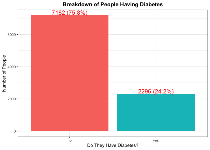
According to the CDC, roughly 11.5% of Americans have diabetes, so we would expect each education level to around this percentage as well. If there is a large deviance from this number, this would be something to make note of.
Another thing we can look at is trying to find the percentage of people in each age group who have diabetes and seeing if the age is dictating who has it. Again if age was not a factor, we should expect to see the percentages throughout the different age groups to be the same.
(
  filter_data_age_percent <- ddply(filtered_data,
                                   .(Age),
                                   function(x)
                                     with(x, data.frame(100 * round(table(Diabetes_binary) / length(Diabetes_binary), 4))))
)
##      Age Diabetes_binary  Freq
## 1  18-24              no 97.93
## 2  18-24             yes  2.07
## 3  25-29              no 94.79
## 4  25-29             yes  5.21
## 5  30-34              no 93.83
## 6  30-34             yes  6.17
## 7  35-39              no 90.91
## 8  35-39             yes  9.09
## 9  40-44              no 86.24
## 10 40-44             yes 13.76
## 11 45-49              no 81.42
## 12 45-49             yes 18.58
## 13 50-54              no 78.56
## 14 50-54             yes 21.44
## 15 55-59              no 73.14
## 16 55-59             yes 26.86
## 17 60-64              no 68.96
## 18 60-64             yes 31.04
## 19 65-69              no 68.69
## 20 65-69             yes 31.31
## 21 70-74              no 67.64
## 22 70-74             yes 32.36
## 23 75-79              no 70.07
## 24 75-79             yes 29.93
## 25   80+              no 74.50
## 26   80+             yes 25.50
filter_data_age_percent %>%
  filter(Diabetes_binary == "yes") %>%
  ggplot(aes(x = Age, y = Freq, fill = Age)) +
  geom_bar(stat = "identity",
           show.legend = FALSE) +
  geom_text(aes(label = Freq),
            vjust = -0.2) +
  labs(
    title = "Percentage of People by Age Group who Have Diabetes",
    x = "Age Group",
    y = "Percentage of People with Diabetes",
  ) +
  theme_bw() +
  theme(plot.title = element_text(hjust = 0.5, face = "bold"))
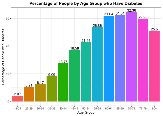
To gain some more context on the reliability of the percentages above by age group, lets see the overall percent makeup for each of the age groups from the sample. Ideally, we’d like to see an equal proportion of observations from each of the age groups.
#create contingency table that dives by number of rows and multiples by 100
#to get the percentages of each age group
round(table(filtered_data$Age) / nrow(filtered_data) * 100, 2)
##
## 18-24 25-29 30-34 35-39 40-44 45-49 50-54 55-59 60-64 65-69 70-74 75-79   80+
##  2.04  2.03  3.94  4.41  5.44  6.53 10.29 11.47 10.91 10.78 11.54  9.62 11.00
Typically we expect that Age will play a factor as one gets older,
their chance of diabetes tends to increase. The
NIH
describes some of the reasons why in a better way than we can by the
experiment they design with the corresponding results.
A lot of people tend to say that BMI is a good indicator of one’s health. Some people may argue that the system is faulty. Take for example someone who is deemed in fantastic health. As sports fans, I typically point to NBA superstar LeBron James. According to his bio at the time this piece was written, he was listed at 6 foot 9 inches tall with weighing in at 250 pounds. His BMI is 26.8, which is considered overweight, while someone (who might be a co-author of this piece) might be listed at 5 foot 11 inches tall with weighing in around 175 pounds with a BMI at 24.4 which is considered normal weight. LeBron James is considered one of the healthiest humans in the world, as this issue arises from BMI not taking into account possible muscle mass. But we can still examine the breakdowns of BMI (as an indicator of someone being overweight and potentially not the healthiest) and seeing if there is a correlation between BMI and getting diabetes. Note a healthy BMI is between 20 and 24.9.
# Set optimal number of bins with this formula; uses Sturges Rule
bw <- min(ceiling(log2(length(filtered_data$BMI) + 1)), 30)

# Make labels for graph
diabetes_label <- c("Diabetes = No", "Diabetes = Yes")
names(diabetes_label) <- c("no", "yes")

# Show histogram of BMI
filtered_data %>%
  ggplot(aes(x = BMI, fill = Diabetes_binary)) +
  geom_histogram(bins = bw,
                 show.legend = FALSE) +
  labs(
    title = "Breakdown of People's BMIs and if They Have Diabetes",
    x = "BMI",
    y = "Number of People",
  ) +
  facet_wrap(~Diabetes_binary,
             labeller = labeller(Diabetes_binary = diabetes_label)) +
  theme_bw() +
  theme(plot.title = element_text(hjust = 0.5, face = "bold"))
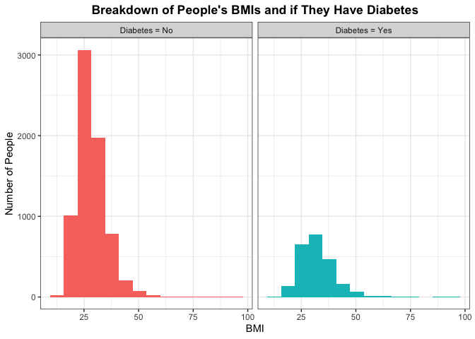
If BMI does have a perceived effect then the histogram for people who do not have diabetes and people who do have it would be different. Otherwise, if the distributions of the histogram look similar between the two then we say that it is plausible that BMI does not have predict (or really correlate) with someone having diabetes.
Lets dig a little bit deeper into the density of BMI by diabetes by looking at some summary measures of BMI and visualizing with a box plot. Here we should be looking for number of outliers and the difference in the IQR for those that have diabetes compared to those who don’t.
# Show summary of BMI
summary(filtered_data$BMI)
##    Min. 1st Qu.  Median    Mean 3rd Qu.    Max.
##   13.00   25.00   28.00   29.64   33.00   95.00
# Show boxplot of BMI
filtered_data %>%
  ggplot(aes(x = BMI, fill = Diabetes_binary)) +
  geom_boxplot() +
  #add appropriate labels
  labs(
    title = "Breakdown of People's BMIs and if They Have Diabetes",
    x = "BMI",
  ) +
  #set limit due to outliers
  xlim(15,65) +
  theme_bw() +
  theme(plot.title = element_text(hjust = 0.5, face = "bold"),
        axis.text.x = element_blank()) +
  #create vertical box plots
  coord_flip()
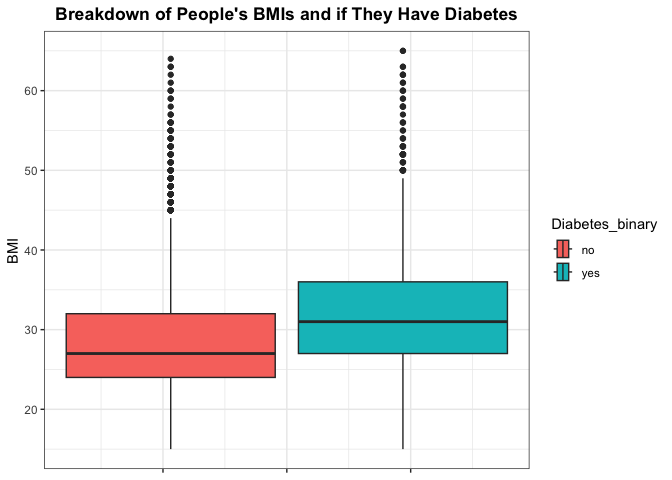
While BMI is regarded as a good indicator of one’s health, we can also
look at some summary measures for the other numeric variables in
Mental Health and Physical Health.
We can compare this to those who have diabetes verse those who don’t. We’d especially want to look at how the means compare across the two groups, as well as if there seems to be interesting findings regarding those without diabetes generally having lower physical health metrics.
First lets look at those who do not have diabetes.
#create summary measures for those without diabetes for mental and physical health
summary(filtered_data[filtered_data$Diabetes_binary == 'no', c('MentHlth', 'PhysHlth')])
##     MentHlth         PhysHlth
##  Min.   : 0.000   Min.   : 0.000
##  1st Qu.: 0.000   1st Qu.: 0.000
##  Median : 0.000   Median : 0.000
##  Mean   : 5.058   Mean   : 7.049
##  3rd Qu.: 5.000   3rd Qu.:10.000
##  Max.   :30.000   Max.   :30.000
Those who do have diabetes.
#create summary measures for those with diabetes for mental and physical health
summary(filtered_data[filtered_data$Diabetes_binary == 'yes', c('MentHlth', 'PhysHlth')])
##     MentHlth         PhysHlth
##  Min.   : 0.000   Min.   : 0.00
##  1st Qu.: 0.000   1st Qu.: 0.00
##  Median : 0.000   Median : 4.00
##  Mean   : 6.135   Mean   :10.63
##  3rd Qu.: 9.000   3rd Qu.:22.25
##  Max.   :30.000   Max.   :30.00
We can also look at a measure of spread by analyzing the standard deviation of the numeric variables across those who do verse don’t have diabetes. Here we’d be interested in looking to see if there are any significant differences in the spread for these variables across each group.
#create data frame of sd measure for numeric variables for those who do not have
#diabetes. Apply the sd function across each column for the relevant columns
#of data frame
no_diab <- as.data.frame(apply(filtered_data[filtered_data$Diabetes_binary == 'no', c('BMI', 'MentHlth', 'PhysHlth')],
                    MARGIN = 2,
                    FUN = sd),
              optional = TRUE)
#create data frame of sd measure for numeric variables for those who do have
#diabetes. Apply the sd function across each column for the relevant columns
#of data frame
yes_diab <- as.data.frame(apply(filtered_data[filtered_data$Diabetes_binary == 'yes', c('BMI', 'MentHlth', 'PhysHlth')],
                    MARGIN = 2,
                    FUN = sd),
              optional = TRUE)
#bind data frames together
sd_diab <- round(cbind(no_diab, yes_diab), 2)
#change column names
colnames(sd_diab) <- c('SD No Diabetes', 'SD Diabetes')
#analyze results
sd_diab
##          SD No Diabetes SD Diabetes
## BMI                6.95        7.87
## MentHlth           9.62       10.29
## PhysHlth          10.89       12.22
We could also look at if Sex has something to do with diabetes
occurring. Again we could make a plot looking at the breakdown of Males
and females with diabetes and see if they similarly match up.
# Make table
(diabetes_sex_table <- table(filtered_data$Diabetes_binary, filtered_data$Sex))
##
##       female male
##   no    4135 3047
##   yes   1377  919
# Specify this for percentage format; specify facet wrap labels
pct_format = scales::percent_format(accuracy = .1)
diabetes_sex_label <- c("Sex = Female", "Sex = Male")
names(diabetes_sex_label) <- c("female", "male")

# Show graph
filtered_data %>%
  ggplot(aes(x = Diabetes_binary, fill = Diabetes_binary, by = 1)) +
  geom_bar(show.legend = FALSE) +
  labs(
    title = "Breakdown of People Having Diabetes",
    x = "Do They Have Diabetes?",
    y = "Number of People",
  ) +
  geom_text(
    aes(
      label = sprintf(
        '%d (%s)',
        ..count..,
        scales::percent(after_stat(prop), accuracy = 1)
      )
    ),
    stat = 'prop',
    nudge_y = .2,
    color = 'red',
    size = 5,
    vjust = -0.2
  ) +
  facet_wrap(~Sex,
             labeller = labeller(Sex = diabetes_sex_label)) +
  theme_bw() +
  theme(plot.title = element_text(hjust = 0.5, face = "bold"))
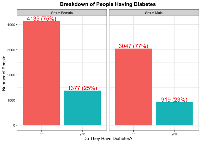
Again here we are trying to find any kind of significant difference with
the percentage of each Sex that has diabetes. We can also make note of
the total number from each Sex as that will help us in gaining an
understanding of which Sex has a majority for type of Education.
While there are genetic predispositions for individuals, there may be
some indication of a persons overall health as to explain why they do or
do not have diabetes. Lets see how one’s general health compares
across those who do have diabetes verse those who don’t. We can
visualize this with a bar chart for the different groups.
#look at general health by diabetes level
filtered_data %>%
  ggplot(aes(x = GenHlth, fill = Diabetes_binary)) +
  geom_bar() +
  labs(
    title = "Breakdown of People's General Health and if They Have Diabetes",
    x = "General Health",
    y = "Number of People",
  ) +
  #create different plots for each diabetes level
  facet_wrap(~Diabetes_binary,
             labeller = labeller(Diabetes_binary = diabetes_label)) +
  theme_bw() +
  theme(plot.title = element_text(hjust = 0.5, face = "bold")) +
  #make sure x axis elements are not overlapping
  scale_x_discrete(guide = guide_axis(n.dodge=2))
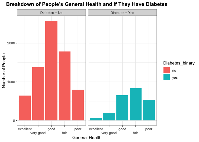
Here we are trying to see any differences in the number of people that make up each category across the different diabetes groups. We’d be interested in seeing if those who don’t have diabetes have a higher frequency of positive general health categories such as excellent or very good, or good. In contrast, we’d want to see if those who do have diabetes have a higher frequency of individuals with poorer health. This may indicate general health conditions being a good predictor to use in classifying whether a person has or does not have diabetes.
From the National Library of Medicine, there was a publishing that
discussed hypertension being twice as frequent in patients with diabetes
compared with those who don’t. Lets see how that compares with our data,
specifically the counts of high blood pressure across those who do
verse don’t have diabetes. We can take this a step further by shading
each of the counts by sex. We can visualize this with a bar chart for
the different groups.
#look at high blood pressure by sex and diabetes level
filtered_data %>%
  ggplot(aes(x = HighBP, fill = Sex)) +
  geom_bar() +
  #add new color scheme to distinguish sex verse diabetes level in previous plots
  scale_fill_brewer(palette = "Dark2") +
  labs(
    title = "High Blood Pressure by Sex and Diabetes",
    x = "High Blood Pressure",
    y = "Number of People",
  ) +
  #look at plots across each diabetes level
  facet_wrap(~Diabetes_binary,
             labeller = labeller(Diabetes_binary = diabetes_label)) +
  theme_bw() +
  theme(plot.title = element_text(hjust = 0.5, face = "bold"))
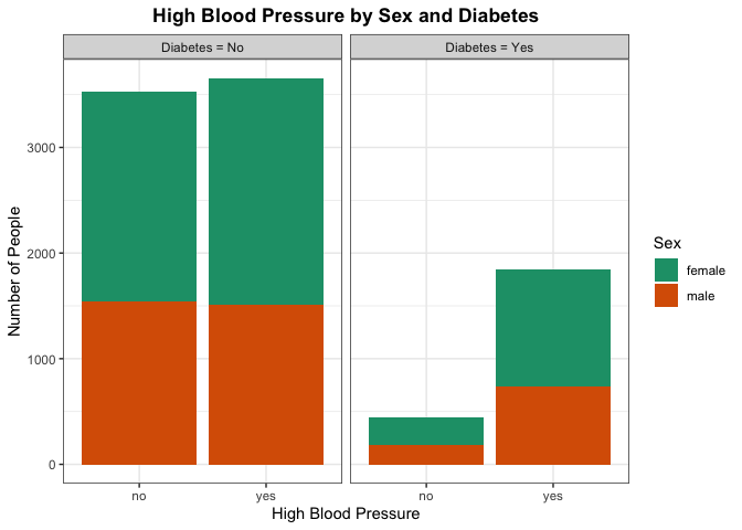
Here we are trying to see any differences in the proportion of people who have high blood pressure across the diabetes category. Particular areas of interest would be seeing if those with diabetes generally have a higher number of people with high blood pressure as well. This may indicate high blood pressure being a good predictor to use in classifying whether a person has or does not have diabetes. We can also look for there being a significant difference by sex for those who have high blood pressure.
Lastly, one might suspect those with diabetes generally are less active.
Lets analyze this by creating a bar plot of physical activity across
those with and without diabetes. We can further shade to see the
proportion of each category by sex
#look at physical activity by sex and diabetes level
filtered_data %>%
  ggplot(aes(x = PhysActivity, fill = Sex)) +
  geom_bar() +
  scale_fill_brewer(palette = "Dark2") +
  labs(
    title = "Physically Active by Sex and Diabetes",
    x = "Physically Active",
    y = "Number of People",
  ) +
  #look at plots across each diabetes level
  facet_wrap(~Diabetes_binary,
             labeller = labeller(Diabetes_binary = diabetes_label)) +
  theme_bw() +
  theme(plot.title = element_text(hjust = 0.5, face = "bold"))
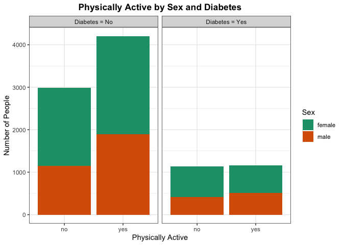
If there are significant differences in the proportion of people who are physically active without diabetes verse those who have diabetes, there may be a correlation between being physically active and having diabetes. More testing would need to be done, but this can provide some evidence for the initial suspicion.
Modeling
Now split the data set into a training and testing set for the highest education level of Grades 9 through 11. Use $p = 0.7$ as told in the directions. The training data will be used to help make the models and the testing data will help us determine our “best” model. Since we are only looking at one education level we can remove that column since all will be the same in our analysis by education level. Lastly, we need to make dummy variables since we have many factors that could take a very long time to run.
# Remove education level
filtered_data_for_analysis <- filtered_data %>%
  dplyr::select(-Education)

# Make dummy variables
dummies <- dummyVars(Diabetes_binary ~ . - BMI - GenHlth - MentHlth - PhysHlth - Age - Income, data = filtered_data_for_analysis)
diabetes_dummies <- as_tibble(predict(dummies, newdata = filtered_data_for_analysis))

# Make combined data frame with dummies and kept columns
filtered_data_with_dummies <- cbind(filtered_data_for_analysis, diabetes_dummies) %>%
  dplyr::select(-c(contains(".no"),
                   contains(".female"))) %>%
  dplyr::select(Diabetes_binary,
                BMI,
                GenHlth,
                MentHlth,
                PhysHlth,
                Age,
                Income,
                contains(".yes"),
                contains(".male"))

# Rename columns
names(filtered_data_with_dummies) <- gsub(pattern = ".yes*", replacement = "", x = names(filtered_data_with_dummies))
names(filtered_data_with_dummies) <- gsub(pattern = ".male*", replacement = "", x = names(filtered_data_with_dummies))

# Create test and train data
set.seed(999)
index <- createDataPartition(filtered_data_with_dummies$Diabetes_binary, p = 0.7, list = FALSE)
train <- filtered_data_with_dummies[index, ]
test <- filtered_data_with_dummies[-index, ]
Now that we have split our data into a testing and training set, we can start with examining different models to best predict on whether someone with certain characteristics is likely to get diabetes.
Log Loss
Log loss is also known as logarithmic loss or cross-entropy loss.
This is used as a common evaluation metric for classification models in
which the response variable follows a binomial distribution (or binary).
It measures the performance of a model by measuring the difference
between predicted probabilities and the actual values. We tend to use
log loss because it provides a continuous measure of our model’s
performance, which in return makes it very suitable for optimization
algorithms. We also like log loss because it penalizes “confident”
(meaning predictions that are heavily in one direction – i.e. saying the
prediction is 0.1 is very close to 0) and incorrect predictions more
heavily, which incentivizes more calibrated or correlated probability
estimates. Lastly, log loss is interpreted as the logarithmic measure of
the likelihood of predicted probabilities aligning with the true
classification. So when comparing other models log loss will do the best
at giving us a model with the “most accurate” predictions unlike other
methods. Therefore, we will use log loss as lower values indicate better
models (and thus, better predictions).
Logistic Regression
Logistic regression is very similar to linear regression but instead
the response variable is binary and estimates the probability of an
event occurring. Since the result of this type of model is a
probability, the response variable is bounded between 0 and 1. In our
case, we are looking at the response variable being the
Diabetes_binary which is either 0 or 1, which meets this condition. We
are also trying to model the probability that someone with certain
characteristics gets diabetes (which is the event we are measuring). One
last note for logistic regression is that a logit transformation is
applied on the odds, as the probability of success divided by the
probability of failure. This is known as the log odds where we are using
the formula
$\ln(\frac{p_i}{1-p_i}) = \beta_0 + \beta_1*X_1 + … + \beta_n * X_n$
with $n$ being the number of predictors.
We are going to use this type of prediction below by supplying 3 different candidate models that use logistic regression and then choose the best 1 from the 3 that will be used in model evaluation later in this report.
#set up train control parameter,using 5-fold cross-validation,
#using class probabilities and log loss as the metric
trC <- trainControl(method = 'cv',
                    number = 5,
                    summaryFunction = mnLogLoss,
                    classProbs =  TRUE)
# Set seed for reproducibility
set.seed(999)
# Train the first model we create
log_model_varImp <- train(
  Diabetes_binary ~ .,
  data = train,
  method = "glm",
  family = "binomial",
  metric = "logLoss",
  preProcess = c("scale", "center"),
  trControl = trC)
# Get important variables
varImp(log_model_varImp)
## glm variable importance
##
##   only 20 most important variables shown (out of 40)
##
##                                      Overall
## BMI                                   100.00
## HighBP                                 76.90
## HighChol                               64.90
## GenHlthpoor                            47.48
## GenHlthfair                            38.32
## CholCheck                              28.93
## `Age70-74`                             25.31
## `Age60-64`                             24.84
## HvyAlcoholConsump                      24.58
## `Age75-79`                             24.17
## `Age65-69`                             23.77
## `Age80+`                               22.77
## GenHlthgood                            22.68
## DiffWalk                               22.61
## AnyHealthcare                          21.76
## `Age55-59`                             21.72
## `Income$35,000 to less than $50,000`   19.76
## `Age50-54`                             18.49
## `Age45-49`                             18.16
## Sex                                    17.59
After looking for the most important variables, the first model that we have determined is only first order with no interactions. We are going to only look at some of the top most important variables. These will be listed in our first model.
First we are going to make a model that is totally linear with no interactions shown.
# Set seed for reproducibility
set.seed(999)
# Train the first model we create
log_model_1 <- train(
  Diabetes_binary ~ BMI + GenHlth + HighBP + HighChol + Age + HvyAlcoholConsump + CholCheck + Sex + HeartDiseaseorAttack,
  data = train,
  method = "glm",
  family = "binomial",
  metric = "logLoss",
  preProcess = c("scale", "center"),
  trControl = trC)

#create function to calculate log loss
LogLoss <- function(actual, predicted) {
  #change yes no of response, to binary 1 0
  actual <- if_else(actual == 'yes', 1, 0)
  #formula for log loss
  result <- (-1/length(actual))*(sum((actual*log(predicted)+(1-actual)*log(1-predicted))))
  return(result)}

# Make predictions
pred_log_1 <- predict(log_model_1, test, type = "prob")

# Get log loss
(log_model_1_error <- LogLoss(test$Diabetes_binary, pred_log_1[2]))
## [1] 0.4750215
We get our log loss here on the linear model with no interaction being 0.4750215. We are now going to see if we should include some interactions. For example, is there an interaction in age and sex? What about high blood pressure and cholesterol? We are going to include some interaction terms with things that are appropriate
# Set seed for reproducibility
set.seed(999)
# Train the first model we create
log_model_2 <- train(
  Diabetes_binary ~ BMI + GenHlth + HighBP*HighChol + Age*Sex + HvyAlcoholConsump + CholCheck,
  data = train,
  method = "glm",
  family = "binomial",
  metric = "logLoss",
  preProcess = c("scale", "center"),
  trControl = trC)

# Make predictions
pred_log_2 <- predict(log_model_2, test, type = "prob")

# Get log loss
(log_model_2_error <- LogLoss(test$Diabetes_binary, pred_log_2[2]))
## [1] 0.4928829
We get our log loss here on the linear model with interaction being 0.4928829. We are now going to see if we this data is better represented as a quadratic model instead by including the second order terms for the predictors. These will be included for numeric variables.
# Set seed for reproducibility
set.seed(999)
# Train the first model we create
log_model_3 <- train(
  Diabetes_binary ~ I(BMI^2) + GenHlth + HighBP + HighChol + Age + HvyAlcoholConsump + CholCheck + Sex,
  data = train,
  method = "glm",
  family = "binomial",
  metric = "logLoss",
  preProcess = c("scale", "center"),
  trControl = trC)

# Make predictions
pred_log_3 <- predict(log_model_3, test, type = "prob")

# Get log loss
(log_model_3_error <- LogLoss(test$Diabetes_binary, pred_log_3[2]))
## [1] 0.4796005
We get our log loss here on the linear model with interaction being 0.4796005. Now what we do is select the model with the lowest error rate. We will use this to compare to other models later.
(best_log_model_error <- min(log_model_1_error, log_model_2_error, log_model_3_error))
## [1] 0.4750215
LASSO Logistic Regression
LASSO logistic regression is an extension of logistic regression, but
instead of minimizing a particular loss function, there is a penalty
term added to the minimization that shrinks certain coefficient
estimates to zero. It can be shown that shrinking coefficient estimates
towards zero increases their bias, but significantly reduces their
variance, which can be an advantage over traditional logistic
regression. A method such as this, particularly with LASSO, also has the
benefit of doing feature selection, by exactly setting some coefficient
estimates to zero. For LASSO logistic regression, the penalty term
that is added is lambda * the sum of the absolute value of all the beta
coefficients. Lambda here is a tuning parameter that serves to control
the relative impact of the loss function and penalization on the
coefficient estimates. As lambda increases, the penalty term dominates
the minimization criterion, and the resulting estimates approach zero.
When lambda is zero, we get exactly the loss function being minimized.
Choosing the optimal lambda value has to do with the bias-variance trade
off. Lambda effectively controls the model complexity, where small
lambda values are closer to the loss function being minimized, which has
lower bias but higher variance. Higher values of lambda on the other
hand lead to a less flexible model, which has higher bias but lower
variance. The optimal lambda value is typically selected through
cross-validation by minimizing the test error, which we will do below.
#create a grid of the lambda values we want tuned
lasso_grid <- 10^seq(-3, 7, length = 100)

#set seed for reproducibility
set.seed(10)
#train the model using glmnet  on the training data set
lasso_fit <- train(Diabetes_binary ~ .,
                   data = train,
                   method = 'glmnet',
                   #center and scale predictors
                   preProcess = c('center', 'scale'),
                   #select log loss as metric to use for selecting optimal model
                   metric = 'logLoss',
                   #set alpha to 1 for lasso, and lambda equal to grid object
                   tuneGrid = expand.grid(alpha = 1, lambda = lasso_grid),
                   #perform 5 fold cv
                   trControl = trC)

#use predict function with final model and best tune to get coefficients
#of best model
predict(lasso_fit$finalModel, s = lasso_fit$bestTune$lambda, type="coef")
## 41 x 1 sparse Matrix of class "dgCMatrix"
##                                              s1
## (Intercept)                        -1.442294351
## BMI                                 0.387697291
## GenHlthvery good                   -0.060086915
## GenHlthgood                         0.141868463
## GenHlthfair                         0.289787945
## GenHlthpoor                         0.320368801
## MentHlth                           -0.038287172
## PhysHlth                           -0.026005576
## Age25-29                           -0.165509863
## Age30-34                           -0.088006954
## Age35-39                           -0.081484033
## Age40-44                           -0.009976723
## Age45-49                            .
## Age50-54                            .
## Age55-59                            0.082889615
## Age60-64                            0.172112109
## Age65-69                            0.138653181
## Age70-74                            0.183831951
## Age75-79                            0.139444357
## Age80+                              0.109574967
## Income$10,000 to less than $15,000  0.013635086
## Income$15,000 to less than $20,000  0.029304156
## Income$20,000 to less than $25,000  0.016149763
## Income$25,000 to less than $35,000 -0.028057327
## Income$35,000 to less than $50,000 -0.089514506
## Income$50,000 to less than $75,000 -0.008744560
## Income$75,000 or more              -0.038354678
## HighBP                              0.381822718
## HighChol                            0.275529600
## CholCheck                           0.177819094
## Smoker                             -0.007979743
## Stroke                              .
## HeartDiseaseorAttack                0.024468831
## PhysActivity                        .
## Fruits                              0.015241653
## Veggies                            -0.004791480
## HvyAlcoholConsump                  -0.111538678
## AnyHealthcare                       0.104776420
## NoDocbcCost                         0.011888951
## DiffWalk                            0.105620847
## Sex                                 0.053384744
Classification Tree
A classification tree partitions the feature space into a set of
regions, and then fits a simple model in each region. Classification
trees are conceptually easy to understand and are useful if the goal of
the statistical model is interpretation. The model first splits the
space into two regions, and models the response typically by the
majority classification in each region. The variable and split-point are
chosen to achieve the best fit and then one or both of these regions are
split into two more regions, and this process is continued until a
stopping criterion is applied. The model is represented by a
binary tree for the splits, which is highly interpretable. The feature
space partition is fully described by a single tree. The binary tree
starts with the root node, or the first split, and each split creates
a new branch. Further split points are called internal nodes, and
the terminal nodes where classification is done, are called the
leaves. When interpreting a classification tree, interests often
include the class prediction corresponding to a particular leaf and the
class proportions among the training observations that fall into that
leaf region. To create a classification tree, the predictor to split on,
the split point, and the depth of the tree all need to be determined.
For selecting the predictor to split on and the split point, often a
measure of node impurity is used to do this, as an ideal node would be
one where all observations are from the same class. Computationally,
this is done by searching every distinct value of every predictor to
find the predictor and split point that partitions the data into two
groups such that the class that maximizes the proportion of training
observations from that class is maximized. To find the optimal depth of
the tree, two methods such as early stopping or pruning are used.
Early stopping restricts tree growth explicitly using a pre-set
criterion, while pruning grows a very large, complex tree, and is pruned
back to obtain a sub-tree the collapses some of the internal nodes. The
pruning is done by tuning a parameter that controls a trade-off between
the subtree’s complexity and its fit to the training data.
Here we will now fit a classification tree and find the best tree by
tuning the cp parameter.
#create data frame of tuning parameter
class_tree_grid <- expand.grid(cp = seq(from = 0.001, to = 0.1, by = .001))

#set seed for reproducibility
set.seed(10)
#train the model using rpart  on the training data set
class.tree.fit <- train(Diabetes_binary ~ .,
                 data = train,
                 method = 'rpart',
                 #center and scale predictors
                 preProcess = c('center', 'scale'),
                 #select log loss as metric to use for selecting optimal model
                 metric = 'logLoss',
                 tuneGrid = class_tree_grid,
                 trControl = trC)

#find best tuning hyperparameter
class.tree.fit$bestTune
##      cp
## 8 0.008
Random Forest
Random Forest combines the output of multiple decision trees to reach a single result that can be used on both regression and classification problems. In this modeling technique, we can say that the model builds a forest, which is an ensemble of decision trees, which are usually trained with bagging. Bagging is a method that combines different learning models which in return will increase the efficiency of the overall result. The final value that we get from the model is the average of all the predictions or estimates created by each individual tree. Random forest uses a subset of predictors at each split for each tree. Unlike classification trees, random forest uses multiple trees which prevents error that may arise due to overfitting our model. Thus, we tend to get more accurate predictions than we do from a classification tree. Lastly, random forest tends to be a better learning model as it uses these multiple trees and not depend as much on the training data. So this is why we prefer to use random forest over classification trees.
Here we are going to make our own random forest model with the diabetes data we are looking at. To improve efficiency, we will tune the hyperparameter using a subset of the training data, and using the optimal tuning parameter, we will train the model on the entire training data.
#create a random sample from the training data set to tune the parameter
set.seed(999)
index <- createDataPartition(train$Diabetes_binary, p = 0.05, list = FALSE)

#index training data
train2 <- train[index, ]

#create data frame of tuning parameter
rf_grid <- expand.grid(mtry = seq(from = 2, to = 5, by = 1))

# tune the model with the subsetted training set
rf.tune <- train(Diabetes_binary ~ .,
                data = train2,
                method = "rf",
                #select log loss as metric to use for selecting optimal model
                metric = 'logLoss',
                preProcess = c("center", "scale"),
                tuneGrid = rf_grid,
                trControl = trC)

#set up new train control parameter, using method = none
trC2 <- trainControl(method = 'none',
                    summaryFunction = mnLogLoss,
                    classProbs =  TRUE)

#train the model on entire training set with optimal mtry
rf.fit <- train(Diabetes_binary ~ .,
                data = train,
                method = "rf",
                #select log loss as metric to use for selecting optimal model
                metric = 'logLoss',
                preProcess = c("center", "scale"),
                #use optimal mtry from the tuning above
                tuneGrid = data.frame(mtry = rf.tune$bestTune),
                #use new train control
                trControl = trC2)
Linear Discriminant Analysis
Linear Discriminant Analysis (LDA) is a technique that is used for classification as a dimension reduction technique. It is used to find a linear combination of features that best separates the classes in our data. It does this by finding a set of linear discriminant values which maximizes the ratio of between-class variance to within-class variance. Some reasons we like to use this modeling technique is because it can work well even if the number of features is larger than the number of training samples and it can handle multicollinearity (or correlation between features) in the data.
We are going to try to fit a model for ourselves using this new technique of Linear Discriminant Analysis.
# Set seed for reproducibility
set.seed(999)
# Train the first model we create
lda_fit <- train(
  Diabetes_binary ~ .,
  data = train,
  method = "lda",
  metric = "logLoss",
  preProcess = c("scale", "center"),
  trControl = trC)
Support Vector Classifier
A support vector classifier is equivalent to a
support vector machine using a polynomial kernel of degree equal to 1
and is an extension of the maximal margin classifier. A maximal margin
classifier aims to fit a separating hyperplane to the data that
perfectly separates the two classes, where the two classes are coded as
-1 and 1. Since the separating hyperplane perfectly separates the two
classes, the response multiplied by the output of the separating
hyperplane evaluated at the predictors, is greater than zero. For new
observations, the prediction is the sign of the output, or classified
based on which side of the hyperplane it is located. One way to find
this separating hyperplane is by minimizing the distance of
misclassified points to the decision boundary. If the classes are
perfectly separable, than there are infinitely many separating
hyperplanes. The best separating hyperplane is one that maximizes the
margin around the separating plane, where the margin is the minimal
distance from the observations to the hyperplane. Naturally, if the two
classes are not linearly separable, there is not a separating hyperplane
that entirely separates the groups, that is, the maximal margin
classifier cannot be computed. This is where the support vector
classifier comes in, which generalizes the ideas of the maximal margin
classifier to develop a classification rule that almost separates the
classes. The support vector classifier allows a few points to fall on
the wrong side of the margin or separating hyperplane. Often, the
support vector classifier is still used even when the maximal margin
classifier can be computed, because the maximal margin hyperplane is
highly variable. The support vector classifier gives each data point a
slack variable, that allows individual data points to be on the wrong
side of the margin or the separating hyperplane. The support vector
classifier then attempts to maximize the margin such that the sum of the
slack variables is less than a pre-specified constant. This
pre-specified constant is the constraint that can be tuned to find the
optimal or best model. By solving the optimization problem, it can be
shown that the classifier is only affected by the observations that lie
on the margin or that violates the margin.
Here we will now fit a support vector classification and find the best
tree by tuning the cost parameter. For the ease of computation, the
cost parameter will be tuned on a portion of the data. The optimal cost
value will then be used in a separate train function call on the whole
training data.
#create data frame of tuning parameter
class_svc_grid <- expand.grid(cost = exp(seq(-5, 3, len = 15)))

#train the model using svmLinear2  on the training data set
class.svc.tune <- train(Diabetes_binary ~ BMI + PhysHlth,
                        data = train2,
                        method = 'svmLinear2',
                        metric = 'logLoss',
                        tuneGrid = class_svc_grid,
                        trControl = trC)

#find best tuning hyperparameter
class.svc.tune$bestTune
##         cost
## 4 0.03741385
#train the support vector classifier on the entire training data set, using the
#optimal cost value found with train
class.svc.fit <- train(Diabetes_binary ~ BMI + PhysHlth,
                       data = train,
                       method = 'svmLinear2',
                       metric = 'logLoss',
                       tuneGrid = data.frame(cost = class.svc.tune$bestTune),
                       trControl = trC2)
Final Model Selection
We now have our six best models that we want to compare on the test set to declare the overall best model. To do this, we will calculate the log loss, our metric of interest, and evaluate this on the real response values and predictions for each of the models.
#find predictions using the lasso fit and test set
pred_lasso <- predict(lasso_fit,
               newdata = test,
               type = 'prob')

#find predictions using the classification tree fit and test set
pred_ctree <- predict(class.tree.fit,
               newdata = test,
               type = 'prob')
# Fix the zero prediction  (comes from trace being too small for R to tell. We are going to call prediction .000001)
pred_ctree <- pred_ctree %>%
  mutate(
    no = ifelse(yes == 0, 1-.000001, no),
    yes = ifelse(yes == 0, .000001,
                 ifelse(no == 0, 1-.000001, yes)),
    no = ifelse(no == 0, .000001, no)
  )

#find predictions using the random forest tree fit and test set
pred_rf <- predict(rf.fit,
               newdata = test,
               type = 'prob')
# Fix the zero prediction  (comes from trace being too small for R to tell. We are going to call prediction .000001)
pred_rf <- pred_rf %>%
  mutate(
    no = ifelse(yes == 0, 1-.000001, no),
    yes = ifelse(yes == 0, .000001,
                 ifelse(no == 0, 1-.000001, yes)),
    no = ifelse(no == 0, .000001, no)
  )

#find predictions using the lda fit and test set
pred_lda <- predict(lda_fit,
                    newdata = test,
                    type = "prob")

#find predictions using the support vector classifier and test set
pred_svc <- predict(class.svc.fit,
                    newdata = test[, c('BMI', 'PhysHlth')],
                    type = 'prob')

#calculate log loss of lasso fit
lasso_error <- LogLoss(test$Diabetes_binary, pred_lasso[2])

#calculate log loss of classification tree
ctree_error <- LogLoss(test$Diabetes_binary, pred_ctree[2])

#calculate log loss of rf fit
rf_error <- LogLoss(test$Diabetes_binary, pred_rf[2])

#calculate log loss of lda fit
lda_error <- LogLoss(test$Diabetes_binary, pred_lda[2])

#calculate log loss of support vector classifier
svc_error <- LogLoss(test$Diabetes_binary, pred_svc[2])


#create data frame to compare the results
(df_log_loss_errors <- data.frame('log_loss' = c(best_log_model_error, lasso_error, ctree_error,
                            rf_error, lda_error, svc_error),
                            row.names = c('Logistic Regression', 'Lasso', 'Classification tree',
                           'Random Forest', 'Linear Discriminant Analysis', 'Support Vector Classifier')))
##                               log_loss
## Logistic Regression          0.4750215
## Lasso                        0.4729009
## Classification tree          0.5084354
## Random Forest                0.4960571
## Linear Discriminant Analysis 0.4729506
## Support Vector Classifier    0.5756311
As we can see here the best model for our data for the highest education level of Grades 9 through 11 is the Lasso model.